BACKGROUND
In 2016, Grameenphone launched an E-commerce platform called Ki Dorkar.com. Ki Dorkar was an aggregator of all the best deals from within other E-commerce platforms. The Puja celebrations were knocking on the door and Ki Dorkar needed a way to promote its products during this festive week.
OBJECTIVE
As the agency, our objective was to achieve 2 things:
- The first was to promote the special items that were available during the Puja festival, and
- Secondly, to promote this new online platform called Ki Dorkar
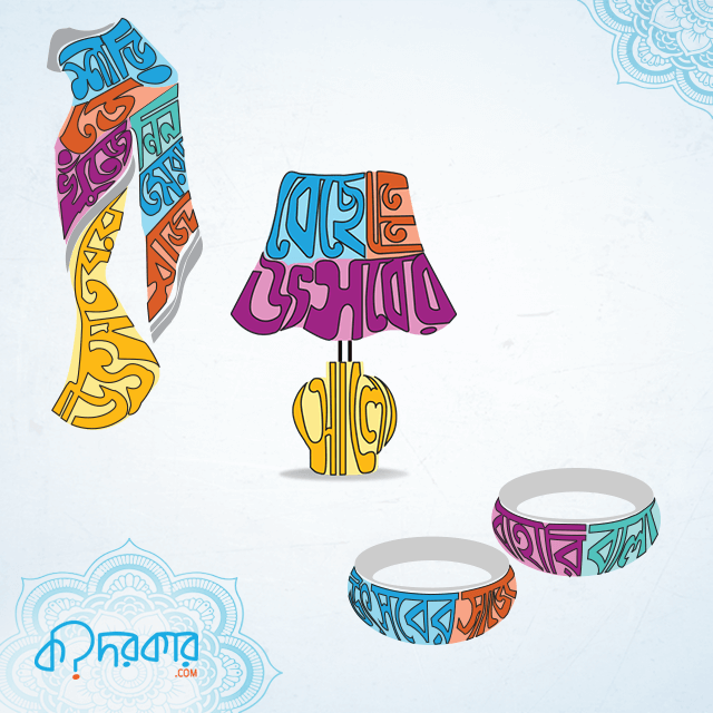
IDEA
The Big Idea was to amalgamate the concept of ‘copy-writing’ with ‘art’, in the literal sense
EXECUTION
At an execution level, we designed the copy typefaces in such a way that those artworks signified each of the individual products that were available in Ki Dorkar Platform during the Puja celebration week. For example, if the message was about a certain jewelry that is available, the description of that jewelry was written in multiple typefaces and multiple colors which took the shape of the actual jewelry. We designed multiple visual communication creatives using this same route.
RESULT
The results were phenomenal! Each and every visual stood out and Ki Dorkar.com received the highest number of clicks onto their web portal in that particular Puja week compared to the previous two quarters of 2016. By this art direction work, it has been proven that whether it’s an E-commerce site or whether it’s a physical shop visual creative communication does have the ability to drive traffic and thus have a positive impact on sales.